INTRODUCTION
- Courtney
- Jan 27, 2021
- 11 min read
Updated: May 14, 2021
Studio Culture: The Secret Life of the Graphic
Design Studio


In Studio Culture Adrian Shaughnessy explores the different way design studios are run all over the world. Shaughnessy outlines that each studio is a combination of three things - physical space, the people that work there and the work produced. I found it particularly interesting that he suggest he can tell a happy studio immediately after walking in due to the combination of these three things.
Another idea that came across strongly to me was the ongoing transaction between the needs of the individual and the collective need of the group. Society is far more individualistic now that it used to be but I wonder if losing that sense of community is going to affect design negatively? It's egotistical v altruistic and in my view design should be altruistic and utilitarian if it is going to make the world a better place and benefit the many not the few. In Studio Culture Shaughnessy adds that because designers want their voices heard the answer is for studios to build a sense of communal purpose while still keeping space for the individual.

As a former Architecture student I was fascinated by was Erik Spiekermann's interview about the importance of the physical space. He suggested that offices should be as transparent as possible and only have closed doors when they really need to (salary discussions, bathrooms etc). He suggests a circular office with low walls so everyone could see and interact with everyone (illustrated left), is the ideal space for creativity to flourish. Although I did disagree when he said that also helped people leaving on time or taking too many bathroom breaks feel the pressure to change their behaviour, surely in a studio environment transparency
and trust should go hand in hand.
Shaughnessy ends the chapter by saying an important part of studio culture is humour, wit and verbal sharpness. I've always found that a happy studio producing excellent work is full of laughter, happiness and motivation creating a healthy and vibrant atmosphere. [1]
Further research
The Architecture of Happiness by Alain de Botton
I was inspired by the idea of physical space being vital to a successful design studio. In The Architecture of happiness de Botton outlines that the main things that make the studio and offices alike flourish is the building being light and airy, open plan and allowing everyone, no matter where they're sitting, to have a view of the outside world. [2]
I think this could be used in studio culture to promote things like ideas sharing, creativity and transparency, all of which have been sighted as ways to make people happier at work. It is a proven thing that people who are happier in the workplace produce a higher standard of work. A lot of this is to do with colleagues but the physical environment is also a factor. Alain suggests that elements such as bringing plants inside and making people surrounded by nature is also a good way to do this.
It would be an interesting study to find different workspaces, for example, a standard office with fluorescent lighting, cubicles and white walls and a modern, light flooded office full of plants and hot desks and talk to the employees to see how their workplace makes them feel. Scientifically speaking better air quality and open plan layouts help employees think, remember, concentrate and perform better. Improvements such as better lighting and less carbon dioxide boost productivity and reduce staff sickness levels, the studies suggest. [3]
Practitioner Case Studies

The week one lecture was a collection of 5 videos of different practices discussing who they were, what they do, where they are, why they love design and how they adapt to change.
Intro

Julian House and Adrian Talbot discussed how they are traditional designers working in silos within a studio. They have separate disciplines and only collaborate when certain skills are needed. However they also discussed that now with ever changing technology and shrinking budgets, working together is becoming more frequent as clients expect a suite of collateral instead of just an animation or a poster for example. I found it really interesting hearing how a more traditional practice is set up and
also that House's idea of a collaborative project is creating a world for the project to inhabit. This immediately made me think of the idea of design as storytelling, to write a good interesting story you need to paint the world you're writing about with words. Design requires the same skills, creating a visual world for people through design.
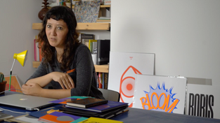
Sarah Boris

Sarah Boris states that her inspiration for all of her design work is always people. People are the centre of everything, they both approve, use and respond to the final design of everything. She also tells us that she looks at everything around her, not just graphic design. Whether that's movies, illustrations, paintings she takes inspiration from everywhere. As an independent Graphic Designer, Sarah is constantly trying to evolve and keep her work up to date with the world
around her. I found Sarah really interesting to listen to, partly because of her statement that accidents can be the most interesting part of design, like when she turned her original poster upside down down and ended up creating the second in the series.
Regular Practice

Tom Finn & Kristoffer Soelling created Regular Practice after meeting at the Royal College of Art in London. They are a typography centred practice that have only been around for just over a year. They set up their own practice in Hackney Wick because they wanted to be able to focus on the work they want to do. They pride themselves with the ability to dive into projects and immerse themselves in it. An ability they think any designer should have. They speak highly of
being in a creative area such as Hackney, surrounded by print shops, graffiti, galleries and other designers, echoing Shaughnessy's idea that the place matters.
Sam Winston

Sam describes design as a verb, not a noun, it's what you are doing rather than what you do. After realising being an in house designer meant he couldn't do the type of work he loved, Sam decided to look for commissions instead. This way of running his studio means that he gets do do what he loves the way he wants to do it. Sam also shares his understanding that design is volatile - you have to keep up to date with the changing times. I also found it interesting that one of the ways Sam says he maintains a healthy work life balance is by keeping everything regular - times for coffee, where you work, when you work. I think this studio culture is extremely advantageous as it prevents burnout.
Some One

Simon Manchipp's studio Someone is responsible for some of the most recognisable branding campaigns in the world, including the London Olympics in 2012. He offers advice to read weird things and to look outwards rather than inwards. This really resonates with me because I have always considered design as a discipline that encourages you to absorb the world around you and take inspiration from everything. He also elaborates on the idea that design is always ahead of the curve and in a way waiting for the rest of the world to catch up. For example, digital working and general office culture. Simon also explains how working with many different clients allows him the creative freedom to explore more elements of design and the ability to alter his focus between different projects.
Visual Life – Michael Wolff

Michael Wolff [4] lists the elements that good design should involve curiosity, appreciation and imagination. These three concepts all need to be considered as the whole is greater than the sum of its parts. He also states that the best way to enter a project is with little knowledge as it means you can approach things with a childlike freshness. One of the parts I found most interesting about this is the idea that designing isn't just about persuading or thinking, it's about moving people. Having worked in the charity sector for the past five years this is always the approach I have taken and will continue to take.
Workshop Challenge – Quadriptych
The brief - To produce a quadriptych with each panel answering the questions Who are you? What is it that you do? Where are you? and Why Design?
This is a really interesting first workshop of the module. My first thought was about how I had always looked at design as looking outward rather than inwards. My second thought was how on earth am I going answer who I am in one image? My third thought was that sounded a bit big headed.
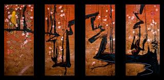
The first thing I decided to do was research triptych's and quadriptych's. This is what I found -
The Garden of Earthly Delights - Hieronymus Bosch


You couldn't research triptychs without mentioning the Garden of Earthly Delights! Since my time studying history of art I have loved this painting, with all the tiny intricacies and weird things (see left) you don't spot at first. This is three separate panels but they are very distinct, three stages of the earth. This will be interesting to explore when designing my answer. [5]
Triptych of Lucian Freud - Francis Bacon

I love this take by Francis Bacon on a triptych. It is images of Bacon's friend and rival Lucian Freud. It shows him from different angles to explore the different sides of his personality and different emotions. It got me thinking about the different way's I could answer the questions using a similar image. [6]
Other triptych's and quadriptych's
After researching the medium and getting a grasp of the questions, I thought it was time to start sketching out my own response to the brief.
I started by trying to answer the questions with words -
Who am I? I am curious, calm, laid back yet sometimes impatient. I want to do everything I can right away because life's short and there is so much to do and experience in the world. I love space travel, music, movies, weird animal friendships and Buffy the Vampire Slayer.
What do I do? I tell stories. For the last five years I have worked for charities designing marketing materials, animations and campaigns, all of this involved being able to take information and present it in a sensitive and persuasive way. I also designed a table that was produced during a rebuild, it was a proud moment seeing it being used.
Where am I? I love in London with my partner Mat. I love the hustle and bustle of the city. One of the things I have missed during the pandemic (weirdly) was the tube. It was a great chance to tune out and read.
Why design? I am interested in everything, I want to learn about everything. I love that design is about looking outwards at the world around us. Like looking though a telescope.
I then started by thinking about the layout of my quadriptych and what they would say about me.

After sketching these options out I decided to go for the bottom left idea, of equal parts lined up next to each other. I want it to reflect calmness and being laid back and measured.
The next stage was to think about the way I want to present - from researching quadriptych's and triptych's I came down to two ideas -
4 illustrations of me from different angles illustrating who I am, what I do, where I am and why design.
A continuous image answering the 4 questions across 4 panels.

This was a sketch of the four different angles of me describing the answers. While I like how this is shaping up I think the idea of me showing the answers is a bit simplistic and doesn't communicate enough information.

Michael Wolff's quote about how we are more than the sum of our parts really grabbed me so I considered changing my layout and encapsulating everything with the quote.
I quickly moved away from this however as I don't think that really illustrates who I am.

I then redrew with an illustration of myself writing a Buffy quote on the wall. The reason I chose this is because it means put effort in and I think I do!
Here is a more refined sketch explaining why I chose the illustrations I did -


I asked for feedback on the ideas wall, I was really happy with the response so decided to stick with this idea.
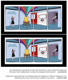
I then finalised the illustration by adding colour. I did one with shading and one without although I think the simple style with no shading fits the aesthetic more and is a representation of my eternal optimism! I also asked the ideas wall and agreed with the advice given.
Development

My initial thought was to have shadow showing depth in the room, hopefully making it more obvious it is a three dimensional space. However I am not sure I think the shadows are very successful and actually the angles themselves show the space my illustrations exist in.

I think removing the shadows was a really good idea, it simplifies the piece and makes the important elements such as the book, tube, telescope and person stand out. I am going to push this further and focus on smaller elements.

I like this style, it's more abstract than my original idea and gives hints to what the panels are about. It has a certain mystery to it, like you can see a glimpse of the answers to the question but not the whole thing, lie this is a glimpse into who we are but not the whole person. I really like this and I think I could push it further...

I think some of these panels are more successful than the others. I think the 'why' panel (number 4) does not get the message across at all, it is far too close up to communicate anything useful. I really like the 'where' panel (number 3), I think it shows just enough of the London Underground roundel for it to be understood. Overall while I like the aesthetic of this version, I think the full pictures were more successful as they communicate far more about the questions.
Final Design

Summary
This was a really interesting start to the module. I really enjoyed the reading and videos, particularly the episode of Abstract on Netflix. The resources really made me think about the process that a designer goes through and how your environment can shape who you are as a designer and the work you produce. I also really enjoyed reading Alain De Botton's Architecture of Happiness again,. I had already read it as part of my degree in Architecture and I remembered a lot of the information about offices and how to make spaces happier and therefore more productive.
I thought the workshop challenge was really interesting and insightful. I have never thought about the answers to these questions and I ended up spending far more time than I thought thinking about it. Especially the question of why. I came to the conclusion that the reason I do design is the same reason I do most things in my life - curiosity. I also really enjoyed researching quadriptychs and triptychs, I've always been interested in art and this was a chance to explore that passion further.
I'm am pleased with my outcome for this week's workshop challenge, I think it communicates well who I am, what I do, where I am and why I do it. I think going forward I would refine the illustration more, possibly experiment with a more detailed version to see if it makes it more interesting. I would also animate this given more time. It is a medium that I am reasonably comfortable with and think it could add a real depth to the image with all 4 panels moving at different times in different directions. This could represent the different elements of me as a person and how they fit together but are all slightly different. Overall though I am happy with the results of this weeks workshop.
Peer Review and Discussion
References
[1] Shaughnessy, A. and Brook, T. (2009). Studio Culture: The Secret Life of the Graphic Design Studio (Links to an external site.) London: Unit Editions.
[2] BOTTON, Alain De. 2006. The Architecture of Happiness London: Hamish Hamilton.
[3] Jezard, A. (2017). The traditional office is dead. Here's why. Available: https://www.weforum.org/agenda/2017/11/forget-the-open-plan-office-modern-work-spaces-should-be-agile/. Last accessed 7/4/21
[4] Wolfe, M. (2011). Intel Visual Life Available at: https://www.youtube.com/watch?v=GfMw8aMzIKQ. (Accessed: 7/4/21)
[5] Museo del Prado. (2021). The Garden of Earthly Delights. Available: https://www.museodelprado.es/en/the-collection/art-work/the-garden-of-earthly-delights-triptych/02388242-6d6a-4e9e-a992-e1311eab3609. Last accessed 7/4/21.
[6] Francis Bacon. (2021). THREE STUDIES OF LUCIAN FREUD. Available: https://www.francis-bacon.com/artworks/paintings/three-studies-lucian-freud. Last accessed 7/4/21.












Comments