HISTORY REVEALED
- Courtney
- Feb 1, 2022
- 8 min read
Updated: Apr 29, 2022
Lecture - History Revealed

I really enjoyed the lecture this week! It was great to have a deeper look into the history of type and the reason we do the things the way we do now. Part that was of particular interest to me was the London Underground map and identity. I live in London and love the city, so hearing more about how the map was developed as well as the Johnston Sans typeface was really interesting and I am definitely going to do more research around this. I went to the Design Museum recently and they have all of the underground maps over the years, it was amazing to see the transformation. Making a bold decision like ignoring geography revolutionised the way maps are made; making it diagrammatic made it so much easier to find your way around and that is still the method we use to this day.
The lecture got me thinking about how you can make people feel something with something as simple as type. Protest art is a great example of this. A lot of the time protest posters only have words on yet people still rally behind it. How much of this is about environment and how much is about the visuals? I really want to explore this more because activism is very important to me and if there is some way to design a typeface that can provoke emotion I would love to know more about it.
I also thought it was interesting listening to Matt Cohen talk about ghost signs and the way signage on streets has moved from informational to persuasive. It would be interesting to know how much truth has been lost in this process - If they were originally designed purely to inform people, you can assume it is true, however now, with the constant bombardment of tag lines and persuasive techniques, how much of it has remained truthful?
Interview with Massimo Vignelli


[1] I found this interview with Massimo Vignelli really interesting - he started by pointing out the things he regrets about the project such as feeling like he could have pushed the idea further, ignoring the geography like the London Underground map. Having travelled around New York City I do think the map is slightly less clear than the London one - I think it could have benefitted from a lack of geography but either way this was clearly an extremely successful project!
I really enjoyed the part when here suggested the popularity of design hardware and software meant there is now a pollution of vulgarity with everyone being able to create, regardless of skill or beauty. From working as an in house designer I really relate to this, people think just because they have the technical ability they too can create something fit for people to see - this couldn't be further from the truth. I've lost count of the amount of times I have had to change type from comic sans, or tell someone the bright purple cannot be read on top of bright red. This hit home!
Signs - Lettering in the Environment

[2] This reading was a bit dense when I started however it did become more interesting! The part that initially grabbed me was when he was talking about design on a large scale being a political act - when you first enter a country, the airport signage for example, can dictate how you should see a place. This brought to mind when you fly into London Heathrow a lot of the signage and posters are about diversity, which makes sense because not only is London one of the most multicultural cities but Heathrow is one of the busiest airports in the world. Newcastle however, has a massive billboard of Newcastle Brown Ale... a very different first impression. This also got me thinking about how far could you go with type? Could you incorporate the political system into it? Or maybe ideal values there? And how would this be done? Typefaces become synonymous with things however, that is usually after the fact; like how gothic typeface in the UK is associated with far right ideologies. I want to research further into if this has happened the other way round.
Later in the reading, the standardisations of street signs is mentioned. I couldn't help but wonder (yes, I'm currently rewatching Sex and the City...) if this 'corporate identity' might mean that places in the UK lose their individual charm. Some places like Stratford Upon Avon are steeped in history, with people travelling from all over the world because Shakespeare was born there - what if the whole town suddenly started looking like Piccadilly Circus or had all of their traditional buildings and street signs replaces with modern ones? It definitely wouldn't have the same vibe.
Something I will take away from this lecture is that we shouldn't wear 'heritage tinted' glasses, instead we should use it to inspire and remind ourselves of all of the possibilities of typeface.
Letters on America


[3] I'm not totally sure what I got out of this reading. I did enjoy it but it didn't leave a particularly lasting impression on me. I understand what Edward Fella was doing and his reasoning behind it, I just didn't find it all that interesting.
I like the idea that when taking a polaroid picture, you can never take the same one twice, you can replicate fonts and type but you can never take exactly the same picture again.
Part of it I did find intriguing was the face that Fella doesn't really throw many out. I am a bit of a perfectionist, something I am learning to let go of a bit more during this course but I still can't imagine being so confident that the first attempt is what I would use.
Change is not Norman

[4] I must admit when I started reading I wondered why on earth this was on the list! But after a while it clicked and it was an interesting read! It is amazing how things move on and times change so quickly now but it was more interesting to see what has remained the same. The fact that kinship and parties remain central in our society is interesting because we have so many ways to communicate now but it will never replace seeing people in person.
I think the interesting part design wise is if we can predict what will be lasting in our society from now on, and if we can predict what will go. This would be useful when thinking about speculative design to map trends and predict what will still be important.
Workshop Challenge
Photograph a broad selection of typography and lettering examples (minimum 10) that illustrate what you believe define the identity of your hometown, nearest city or surrounding area. We want you to research and collect a broad range of examples taken from historical and contemporary reference points.
Your collection should be edited down to five examples you think best reflect the identity of your location.
Note down the exact location to include street name, building number, city/town, area postcode and, if possible, the longitude/latitude on Google maps as we want you to log your examples on the GeoType page on the MA Graphic Design website.
The aim of this challenge is for us to curate and examine vernacular letterforms. Please work hard to collate diverse examples, such as hand drawn, printed, weathered, worn, industrial and pristine. We want to see you looking from all perspectives and not just street level.
I took a walk from Wandsworth to Battersea Park (around 4.5 miles) and these are the most interesting letter forms I found -
One of the things I love about London is walking along the river, stopping for beers on a nice hot day. It was unfortunately January so there was no sun or beer but I decided to walk my favourite route to Battersea park.

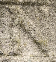
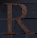
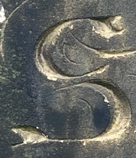
I really liked the mix of historical and contemporary letter forms which I think is a beautiful representation of the city of London, and South West London in particular. I wanted to take a closer look at my top 10 letter forms I found, I think this will help me narrow it down. It is really important to me to keep both the historical and the modern. London has so much rich history which I really don't want to ignore in this project.
All Saints Church, Wandsworth (Grave)
The present church originates from 1630, further alterations and additions were made in the 19th century and this appears to be when a lot of the graves originate. The gothic script would have been hand-drawn on paper and then transferred to the stone surface. Wandsworth has always been a working town, from farming to woodworking, it has been a hub of traditional skills, this is shown in the expert carving of this grave. I think the history of Wandsworth is celebrated in traditional letter forms such as this and it also shows the importance of the Church in the expansion of Wandsworth.
Windover Piano sign, Wandsworth High Street
This is one of the only ghost signs I could find on my walk. I think this is a beautiful representation of Wandsworth being a vibrant bustling hub of shops and people. I can’t find out much about this sign, but Windover Piano was established in 1877 in Kentish Town making Pianos to sell in London and Manchester. I think this represents industrial Wandsworth, something that is still evident today; the high street is packed with experts making specialised items. I love the idea that a ghost sign is still representative of the high street today.
Palace Theatre, Wandsworth
Built in 1920 the Palace theatre has since been taken over by Pure Gym. I think this perfectly represents the juxtaposition in Wandsworth between the new and the old. The area has become gentrified over the last decade or so meaning historical buildings have been taken over by big companies. The Palace Theatre has gone through many guises since 1920, being closed during the war, then converted into a bingo hall before becoming a cinema and then a nightclub before taking its current form of a gym since 2016. This represents the ever developing face of Wandsworth and although it has changed with the times, it still retains its original 1920 façade.
Things will be fine poster, Upper Richmond Road
After following the QR code on the poster, I found out this is an advertisement for Metronomy’s new album. I thought it was interesting when comparing it to the Windover Piano sign as it shows that music has always been important in Wandsworth. Since the 12th Century Wandsworth has been a hub for immigrants from all over the world, maybe music is such a big part of it because everyone can understand it, no matter what language they speak. I think this says so much about Wandsworth now as it is still a cultural hub with many nationalities living in the same town.
War Memorial Of The 24th East Surrey Division, Battersea Park
The WWI memorial, designed and sculpted by Eric Henri Kennington RA (1888-1960) in Portland stone was erected in 1924. I has been affectionately given the nickname “Trouserless Tommies” as it looks like the solders aren’t wearing any trousers. The monument was hand carved and the lettering specifically was done by Kennington’s assistant, it is a serif typeface that would have been relatively simple to carve giving the monument a more modern feel. This monument is important, especially in its context because so many men from Battersea died during WW1 and this was a great way to remember them.
References
[1] Hustwit, Gary (2015) ‘A Rare Interview with Graphic Design Legend Massimo Vignelli ’, Fast Company, 24 March [online]. (Accessed: 5th December 2018)
[2] Baines, Phil (2003) Signs, Lettering and Environment, (London: Laurence King)
[3] Blackwell, Lewis (2000) ‘Edward Fella: Letters on America’, Princeton Architectural Press
[4] Bentley, Alexander and O’Brian, Michael J. (2017) ‘Chapter 2: Change is not Norman’) in The Acceleration of Cultural Change, (Cambridge, Mass: MIT Press)
[5] Wandsworth Council. (2019). The history of the borough. Available: https://www.wandsworth.gov.uk/planning-and-building-control/building-conservation-and-design/listed-buildings-and-borough-history/the-history-of-the-borough/. Last accessed 1/2/22.
[6] Monument Lettering Centre. (2021). A History of Monument Lettering and Design. Available: https://www.monumentletteringcenter.com/history-of-monument-lettering/. Last accessed 1/2/22.
[7] Derry, C. (2011). Ghost signs (50): Windover Pianos. Available: https://carolineld.blogspot.com/2011/02/ghost-signs-50-windover-pianos.html. Last accessed 1/2/22.
[8] Roe, K. (2005). Gaumont Wandsworth. Available: http://cinematreasures.org/theaters/14768. Last accessed 1/2/22.
[9] Metronomy. (2022). Things will be fine. Available: https://metronomy.lnk.to/TWBF. Last accessed 1/2/22.
[10] Jonathan Black, `Thanks for the Memory': War memorial, spectatorship and the trajectories of commemoration 1919-2001, in Matters of Conflict: Material culture, memory and the First World War, ed. Nicholas J. Saunders (2004)
[11] Historic England. (2005). War Memorial Of The 24th East Surrey Division, Battersea Park. Available: https://historicengland.org.uk/listing/the-list/list-entry/1391503?section=official-listing. Last accessed 1/2/22.
[12] BBB, (2018), BBC Sounds: World War One at home [Podcast], Available from https://www.bbc.co.uk/sounds/play/p031yq7j


Comments